
Index.html
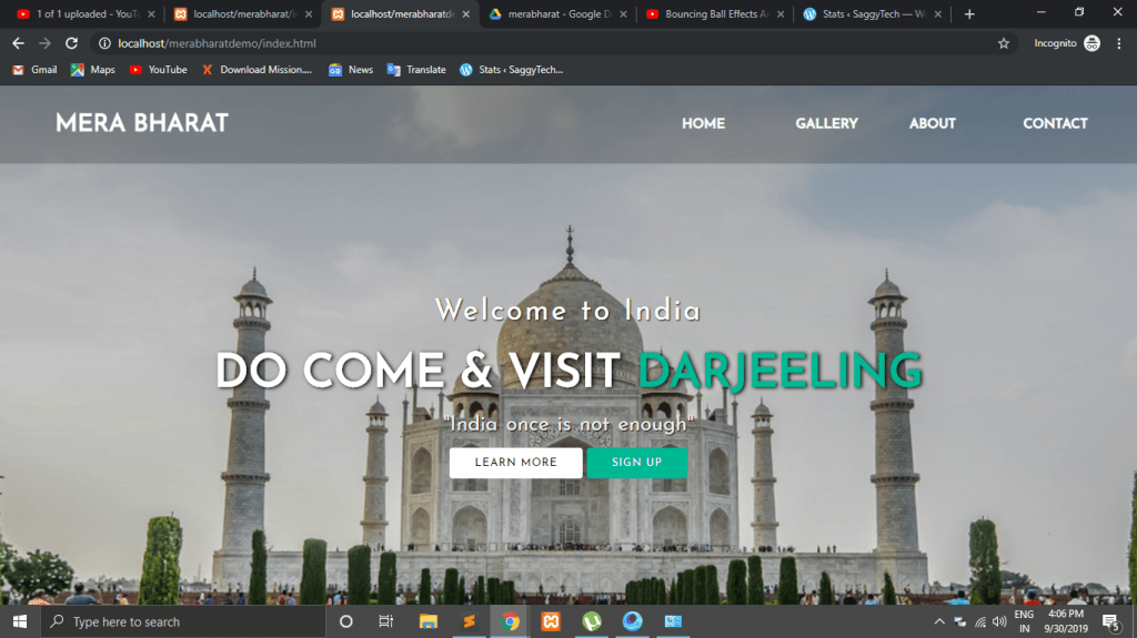
<!DOCTYPE html>
<html>
<head>
	<title></title>
	<link rel="stylesheet" type="text/css" href="css/style.css">
	<link href="https://fonts.googleapis.com/css?family=Josefin+Sans&display=swap" rel="stylesheet">
	<link rel="stylesheet" href="https://cdnjs.cloudflare.com/ajax/libs/animate.css/3.7.2/animate.min.css">
</head>
<body>


<header>
	<nav>
			<div class="logo"><h1 class="animated infinite heartBeat">Mera Bharat</h1></div>
		<div class="menu">
			<a href="#">Home</a>
			<a href="#">Gallery</a>
			<a href="https://www.youtube.com/channel/UCWZ7uYDgLj21DN-LqTi9MOg">	About</a>
			<a href="#">Contact</a>
		</div>
	</nav>
			<main>
			<section>
				<h3>Welcome to India</h3>
				<h1>DO COME & VISIT<span class="change_content"> </span></h1>
				<p>"India once is not enough"</p>
				<a href="#" class="btnone">learn more</a>
				<a href="#" class="btntwo">Sign up</a>
			</section>
		</main>
</header>
</body>
</html>
Style.css
*{
	margin: 0; padding: 0; box-sizing:border-box;
	font-family: 'Josefin Sans', sans-serif;
}

header{
	width: 100%; height: 100vh;
	background-image:linear-gradient(rgba(0,0,0,0.3),rgba(0,0,0,0.1)),url('../images/taj.jpg');
	background-repeat: no-repeat;
	background-size: cover;
}

nav{
	width: 100%; height: 15vh;
	background-color: rgba(0,0,0,0.2);
	color: white; display: flex; justify-content: space-between;
	align-items: center; text-transform: uppercase;
}

nav .logo{
	width: 25%; text-align: center;
}

nav .menu{
	width: 40%;
	display: flex; justify-content: space-around;
}

nav .menu a{
	width: 25%;
	text-decoration: none; color: white;
	font-weight: bold;
}

main{
	width: 100%;
	height: 85vh;
	display: flex;
	justify-content: center;
	align-items: center;
	text-align: center; color: white;
}

section{

}

section h3{
	font-size: 35px; font-weight: 200; letter-spacing: 3px;
	text-shadow: 1px 1px 2px black;
}

section h1{
	margin: 30px 0 20px 0;
	font-size: 55px;
	font-weight: 700;
	text-shadow: 2px 1px 5px black;
	text-transform: uppercase;
}

section p{
	font-size: 25px;
	color: #eee;
	word-spacing: 2px;
	margin-bottom: 25px;
	text-shadow: 1px 1px 1px black;
}

section a{
	padding: 12px 30px;
	border-radius: 4px;
	outline: none;
	text-transform: uppercase;
	font-size: 13px;
	font-weight: 500;
	text-decoration: none;
	letter-spacing: 1px;
	transition: all .5s ease;
}

section .btnone{
	background:#fff;
	color: #000;
}

.btnone:hover{
	background: #00b894;
	color: white;
}

section .btntwo{
	background: #00b894;
	color: white;
}

.btntwo:hover{
	background:#fff;
	color: #000;
}

.change_content:after{
	content: '';
	animation: changetext 10s infinite linear;
	color: #00b894;
}

@keyframes changetext{
	0%{content: "Darjeeling";}
	20%{content: "Agra";}
	35%{content: "Jaipur";}
	60%{content: "Gujrat";}
	80%{content: "Delhi";}
	100%{content: "Mumbai";}
}
 SaggyTech